
- Usage
- Configurations
- Styles
- Accessibility
Usage
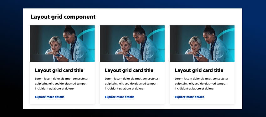
Use the layout grid component to create mutli-column, fully responsive layouts that are evenly spaced with more flexibility in the AEM grid.
Components such as teaser cards, images, buttons, and text can be added to the layout grid component.
*Note: The layout grid component aligns every component horizonatally, so you can't add containers that are evenly spaced with vertically stacked elements, everything will display in columns.
Common usage includes:
- Card grids
- Image grids
- Side-by-side buttons
- Stats without supporting text
Dos and don'ts
Do:
- Use the column layout options to create uniform layouts and organize information into a grid
- Use the bento box to highlight stats or organize information into a single section
- Keep each box in the bento box component to a single idea
- Use consistent color schemes for cards, containers, links, and buttons
Don’t:
- Add too much content to a card in the column layout configuration
- Add too much content to a card in the bento box configuration, especially the smaller containers
- Use the largest callout text style in the bento box if the stat or title is longer
- Use a 4,5, or 6 column layout with long titles and descriptions because it will overlap other content
- Stack multiple components in the bento box, keep each box to a single idea
- Use multiple background colors on cards or containers - alternating colors can create a distracting layout
Configurations
Configurations demonstrate the ways a component can be combined with other component(s) in AEM.
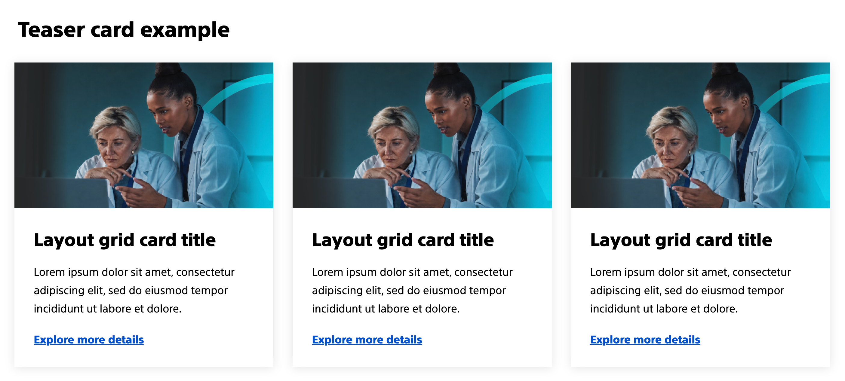
Column layout with teasers
The teaser card component can be nested inside the layout grid component and styles can be applied to the teaser card within the layout grid component. See the teaser card component detail page for more information.
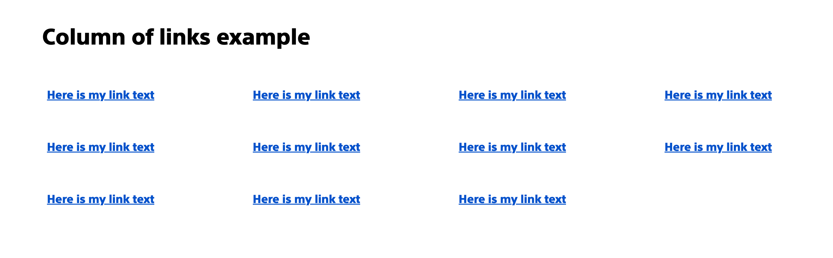
Column layout with buttons/links
The button/link component can be nested inside the layout grid component. See the button/link component detail page for more information on options and styles.
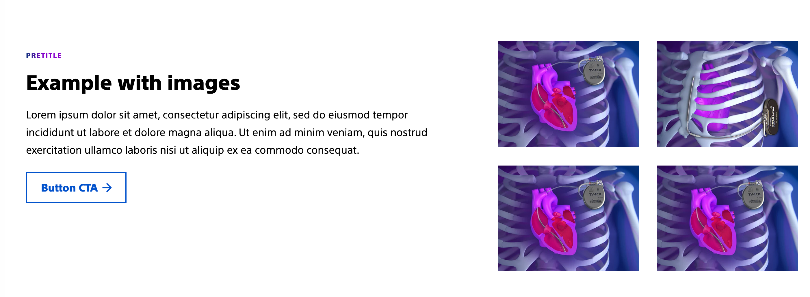
Column layout with images
The image component can be nested inside the layout grid component. See the image component detail page for more information on options and styles.
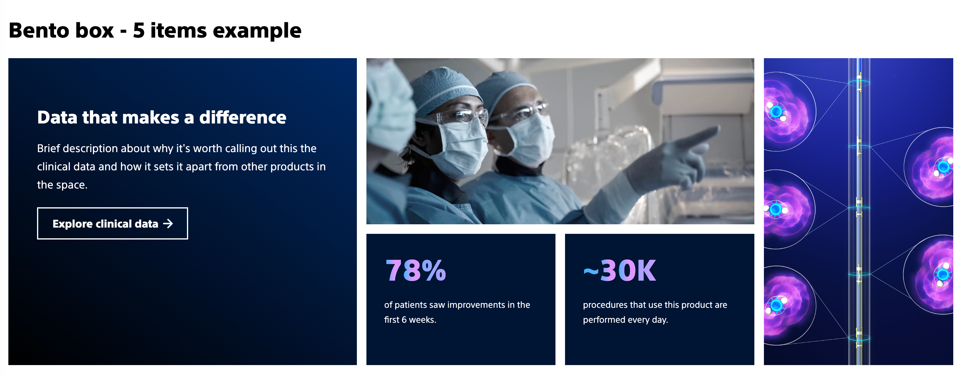
Bento box - 5 items
The teaser, image, container, text, and button components can be nested inside the bento box configuration. Visit the example page to see how to add items and apply styles to these nested components.
Bento box - 7 items
The teaser, image, container, text, and button components can be nested inside the bento box configuration. Visit the example page to see how to add items and apply styles to these nested components.

Styles
Styles carry different treatments: brand and functional.
Brand treatments are used to visually amplify the Boston Scientific brand. These treatments focus on elements that reinforce the brand’s identity, such as color, typography, and other visual cues that are distinctly associated with Boston Scientific.
Functional treatments are structural and help organize content on the page. These include aspects like margins, padding, and layout options that impact the technical structure and usability of the page, but are not directly tied to brand amplification.
Applying styles to the layout grid component
Layout grid component
Functional treatments:
- Padding - Remove column gap: This allows authors to remove the column gap from the AEM grid to have cards, bento boxes, and other items line up with containers.
- Equal height cards: Enables teaser cards withint the layout grid component to have backgrounds that are equal height and links to be aligned across all cards.
Nested components
Brand treatments for nested components:
- Teaser card: Background color, bottom accent gradient (vertical card with no image), accent pretitle, shadow
Functional treatments for nested components:
- Teaser card: Image aspect ratio (adjusts images in teaser cards to be the same aspect ratio), button/link style
- Button/link: Assertive button, default button, default link, ghost button, and subtle link
- Image: Image aspect ratio (adjust images to be the same aspect ratio or to be closer aspect ratios to other content types such as cards)
Accessibility
This component passes AA WCAG standards. However, changes made by the content owner or implementer could impact accessibility compliance. Be sure to follow code standards and content guidelines to ensure that this component is fully accessible.


