
- Usage
- Configurations
- Animations
- Styles
- Accessibility
Usage
Embed can display content from Vimeo and DAM assets. Use Vimeo to display third-party content and DAM for enterprise-hosted content.
- Showing how a product or therapy works
- How-to videos for patients
- Patient stories
- Physician and patient testimonials
- Company videos
Dos and don'ts
Do:
- Make videos stand out by adding a brand treatment and putting ample space around the embed
- Keep videos between 6-8 columns on desktop and tablet views so they stand out, but aren't too big
Don't:
- Overuse brand treatments to make sure the page isn't busy or embeds compete with one another
- Make videos too big (larger than 8 columns) because they could get cut off in the browser or overwhelm users
Vimeo
Vimeo is our primary video player for BostonScientific.com and Vimeo videos can be added to the embed component to display these videos on our website.
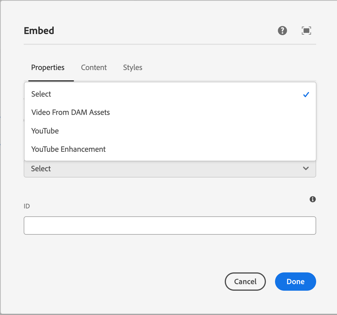
Configurations
The embed component has several configuration options including vimeo videos, YouTube videos, and DAM videos, each serving a different purpose and specific authoring guidelines.
DAM Videos
DAM Videos are added via the 'Embeddable' tab in the component dialog and use MP4 files from the AEM DAM to add a video to the page.
In order for autoplay videos to display properly, add the 'Single play video controls' style to the embed component.
When to use this?
Use this configuraiton for autoplay videos. See the animation tab for more details.
Vimeo
Vimeo is our primary video player for BostonScientific.com and Vimeo videos are added via the 'URL' tab in the component dialog and use Vimeo urls to be added to the page.
In order for the Vimeo video to display responsively, add the Vimeo workaround style to the component.
When to use this?
Use this configuration for any video on BostonScientific.com that doesn't use the autoplay feature.
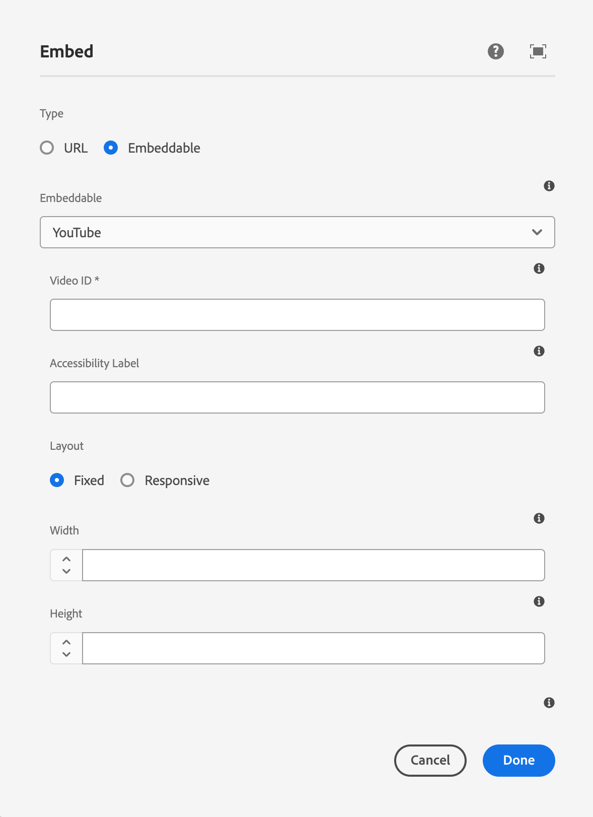
YouTube
YouTube should only be used if the video is approved by legal and regulatory, not available in Vimeo, and is needed to support a page launch.
Animations
Animations are used to create a more dyanmic, engaging web experience by drawing attention to or highlighting key information on webpages by using subtle movements, autoplay videos, or color changes.
Dos and don'ts
Do:
- Use autoplay for short videos/animations to draw attention and reduce friction to key information or to create a more engaging web experience.
- Use videos without any sound.
- Use the single play feature, with no video controls for animations that are less than 5 seconds to create more dynamic webpages.
- Use the loop feature for shorter videos (5-10 seconds) and always include a single play/pause button. Use the single play feature for longer videos (15 seconds +).
- Always include the single play/pause button on videos longer than 5 seconds or for videos that use the loop feature.
Don't:
- Don't use autoplay videos with sound enabled
- Don't overuse this feature or have multiple autoplay videos in the same section.
- Don't use the loop for videos that are more than 10 seconds.
- Don't remove all video controls when using the loop feature.
Example
Styles
Styles are used to visually amplify the Boston Scientific brand. Styles carry different brand or functional treatments that bring a distinctive look to our webpages while also helping to emphasize key information.
Using the brand treatment
The brand treatment should be used to visually emphasize content and provide a more tailored and distinctive look and feel to a webpage. Be mindful not to overuse and avoid treatment competing with other imagery. Ensure a balanced visual hierarchy.
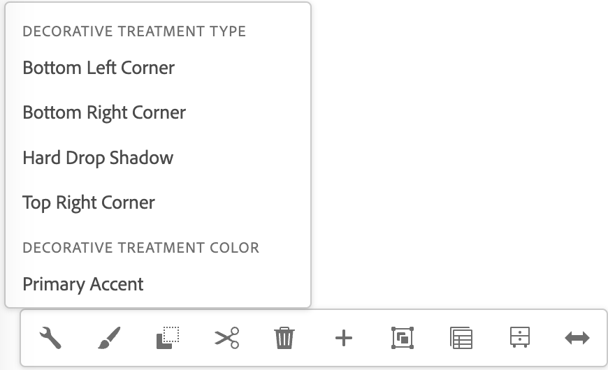
This treatment is applied by selecting a treatment type and treatment color.
Available treatment types
- Bottom left corner
- Top right corner
- Hard dropshadow
Available treatment colors
- Primary accent
- Secondary accent
- Primary gradient
- Secondary gradient
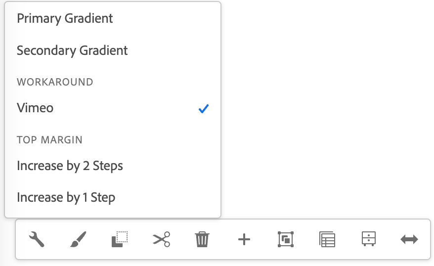
Using the functional treatment
The functional treatment should be used to change the way a component operates to make it better fit the use case on a web page.
Top margin
Apply top margin to create space between two components or to create more space within a container component. Options include: Default (selected by default), Increase by one step, Increase by two steps, Decrease by 1 step, Decrease by 2 steps, Remove.
Authoring
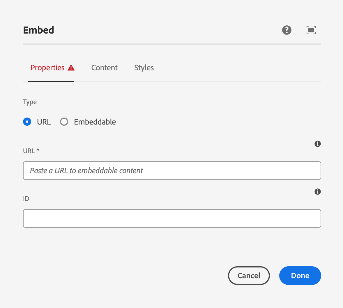
AEM guidelines
This component enhances the user experience by allowing rich media content to be viewed without leaving the page or disrupting the flow of interaction.
- Embed allows third-party content to be added to a page
- Media can be added from a supported URL, a pre-configured embeddable URL, or with safe freeform HTML
- For general information about the Embed Core Component, refer to AEM's Button Component documentation
