


- Usage
- Styles
- Animations
- Accessibility
Usage
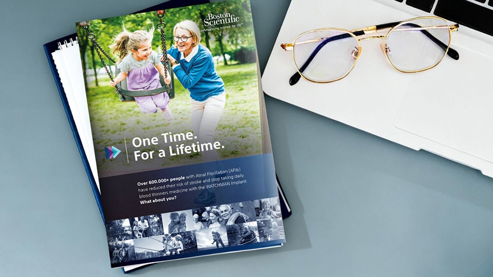
Use the Container component to group related content and maintain consistent alignment across different screen sizes. It is ideal for creating modular layouts and organizing complex pages.
Common usage includes:
- Grouping different content types together such as text and media.
- Structuring layouts to support responsive web design.
- Highlighting key information or creating call-outs.
Dos and don'ts
Do:
- Use containers to maintain alignment and spacing.
- Use containers to create more visually balanced layouts.
- Nest components logically for better content hierarchy.
- Apply responsive settings for mobile optimization.
- Modify text color and icons to meet accessibility requirements for different background colors.
- Apply padding and spacing that works on all devices.
Don’t:
- Over-nest containers unnecessarily.
- Use containers for single components without specific layout requirements.
- Add dark text or dark icons to dark background colors or add light text and light icons to light background colors.
- Apply large spacing or padding when you have callout text with long words.
Styles
Styles carry different treatments: brand and functional.
Brand treatments are used to visually amplify the Boston Scientific brand. These treatments focus on elements that reinforce the brand’s identity, such as color, typography, and other visual cues that are distinctly associated with Boston Scientific.
Functional treatments are structural and help organize content on the page. These include aspects like margins, padding, and layout options that impact the technical structure and usability of the page, but are not directly tied to brand amplification.
Brand treatment options
The brand treatment is applied by selecting a treatment type and treatment color.
Available treatment types
- Shadow treatment type
- Bottom gradient border treatment type
- Arrow pattern treatment type
- Top-bottom split treatment type
Available treatment colors
- Action
- Accent Primary
- Assertive
- Ghost
- Assertive Gradient
- Subtle
- Vertical gradient
- Subtle gradient
- Dark blue
Recommended treatment pairings
Shadow
- The Shadow treatment type works best with these treatment colors: Default or Ghost background colors.
Bottom gradient border
- The Bottom gradient border treatment type can be used on all background colors, but works best on Default or Ghost with Shadow, Action Blue, Dark Blue, or Assertive.
Arrow pattern
- The Arrow pattern treatment type works on all background colors, but is not recommended on Default or Ghost unless the Shadow treatment is also applied.
Top-bottom split
- The Top-bottom split treatment type only works on Subtle, Action Blue, Primary Accent, and Assertive background colors.
- To use Top-bottom split, you need to add 3 containers:
- The first container should have a solid background color.
- The second container will be placed below it and have the same background color with Top-bottom split applied.
- The third container can be nested inside the Top-bottom split container; recommend using Subtle or Ghost with Shadow treatment for that container.
Functional treatment options
Padding
- Creates space on the inside of the container
- Options inlcude: Default, Decrease, Increase, Increase by 1 step, Increase by 2 steps, Decrease by 1 step
Top margin
- Used to create space between a container another element directly above it
- Options include: Default, Increase by 1 step, Increase by 2 steps, Decrease by 1 step, Decrease by 2 steps
Justify content
- Allows content to be vertically centered within a parent container
- Options include: Justify-default, Justify-increase, Justify-decrease. These selections determine how much padding is on the side of the content withint the parent container and determing how much content is on the top and side on mobile.
- To use Justify content, you need to add at least 2 containers or 1 container and an image:
- The first container is the parent container is where the 'Justify Content' is applied
- The child containers or container and image will be nested in the parent container; if using Title, Text, and Button, it needs to be in a container to work
Equal height cards
- Enables teaser cards to be the same height in horizontal layouts within a container component. The teasers need to be siblings for this to work, do not nest in containers
Content height match
- Enables text in a container and an image in the container to always be the same height; when the height of the content changes, the height of the image adjusts to match it
- To use this, you need to add 2 containers and an image:
- The first container is the parent container is where the 'Content height match' is applied
- The second container will be nested in the parent container and will have text, buttons, etc.; You can add padding to this container to create a more balanced layout
- The final item is an image component. The image component must be sibling of a container component for this to work
Animations
Animations are used to create a more dyanmic, engaging web experience by drawing attention to or highlighting key information on webpages by using subtle movements, autoplay videos, or color changes.
Dos and don'ts
Do:
- Use the arrow pattern animation to draw attention to a key call-to-action.
- Use the background color change animation to draw attention to key information such as a how it works video, product highlights, or other differentiators.
- Use the background animation on full bleed containers.
- Pair background background animations with autoplay videos for a more engaging experience.
Don't:
- Don't use the background color animation on PDPs
- Don't use background or arrow animations on multiple sections in a row.
- Don't use the background color animation on containers that aren't full bleed.
- Don't use the background and arrow animation together.
- Don't use the arrow animation on multiple sections of a page.
Examples
Arrow animation demo
Background animation
Lorem ipsum dolor sit amet, consectetur adipiscing elit, sed do eiusmod tempor incididunt ut labore et dolore magna aliqua. Ut enim ad minim veniam, quis nostrud exercitation ullamco laboris nisi ut aliquip ex ea commodo consequat.
Accessibility
This component passes AA WCAG standards. However, changes made by the content owner or implementer could impact accessibility compliance. Be sure to follow code standards and content guidelines to ensure that this component is fully accessible.
- Be sure to use the correct text and background color combinations to ensure WCAG compliance for color contrast.


