

- Usage
- Configurations
- Styles
- Accessibility
Usage
Use the carousel component to present multiple related items in a single space, allowing users to browse through them without leaving the page and create a more interactive experience for our users.
Components such as teaser cards, videos, and images can be added to the carousel component to support various content needs.
Common usage includes:
- Physician testimonial videos
- Featured stories
- Campaign highlights
Dos and don'ts
Do:
- Use this for featured information such as news, patient stories, product updates, and physician testimonials
- Put the most important information on the first slide just in case users don’t click to reveal more info
- Use mixed media to create a more dynamic experience (images or videos + content)
- Keep it to 6-8 modules max within the section (3-4 pages) to avoid overloading the page with content users might not ever see
- Use consistent color schemes for cards and video content
Don’t:
- Hide critical information only in Carousel slides
- Overuse this feature because it can lessen the visual impact and create more friction for important information
- Add more than 8 modules because that can increase page load and it's not likely users will ever see content that it takes 2 or more clicks to get to
- Use multiple background colors on cards or alternate colors as this can create a distracting layout
Hero Carousel
The Hero Carousel is a specific version of the Carousel component, and it is only used on the BSC.com homepage and campaigns.
Configurations
Configurations demonstrate the ways a component can be combined with other component(s) in AEM.
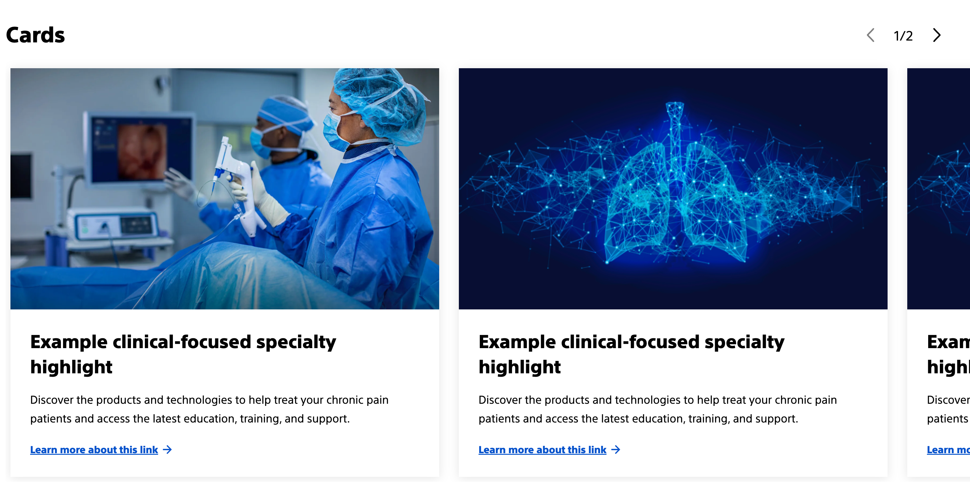
Carousel with Card (teaser) Component
Teaser cards can be added to a Carousel. See the Card (teaser) component detail page for more information.
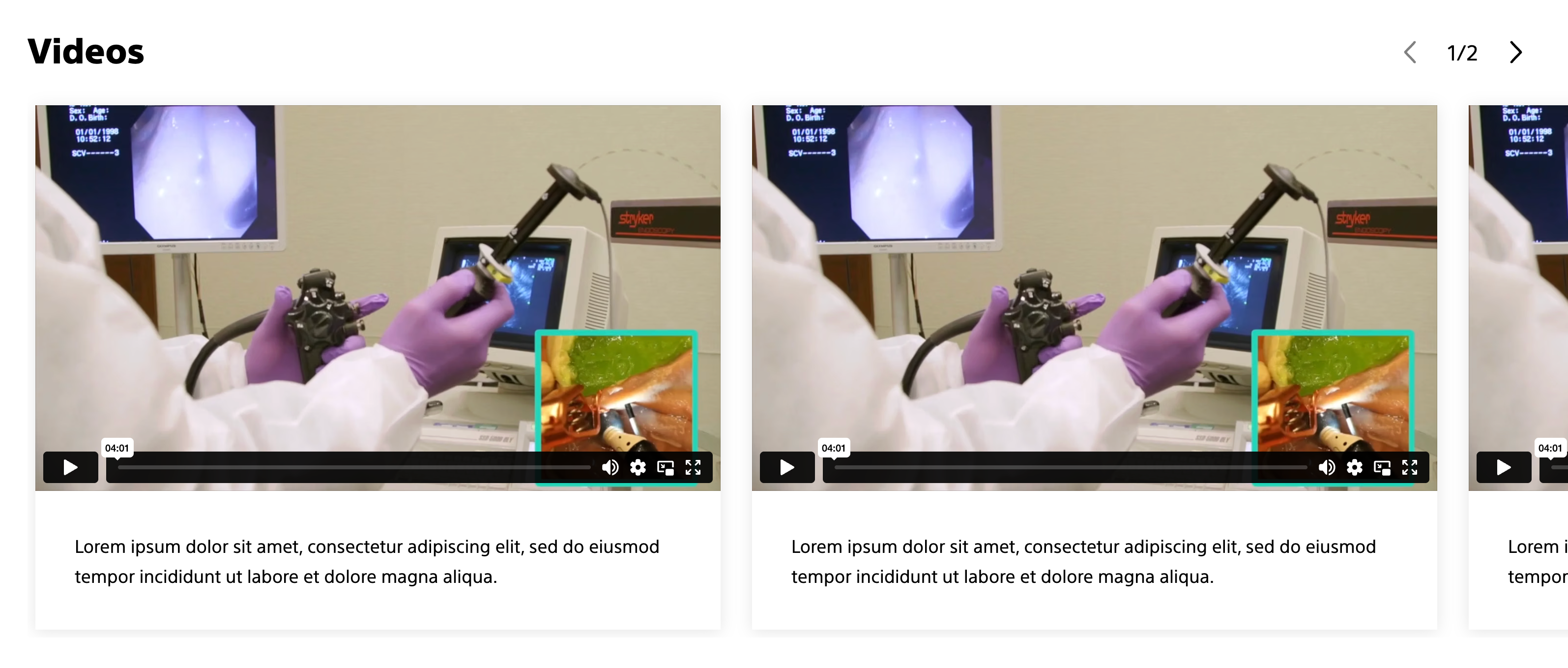
Carousel with Embed component
Embedded media such as video can be added to a Carousel. See the Embed (media) component detail page for more information.
Carousel with mixed media (Card (teaser) + Image)
Images can be added to a Carousel. See the Image component detail page for more information.

Carousel with container component
The carousel component can be nested inside a container component to add additional styles. See the container component detail page for more information.
Styles
Styles carry different treatments: brand and functional.
Brand treatments are used to visually amplify the Boston Scientific brand. These treatments focus on elements that reinforce the brand’s identity, such as color, typography, and other visual cues that are distinctly associated with Boston Scientific.
Functional treatments are structural and help organize content on the page. These include aspects like margins, padding, and layout options that impact the technical structure and usability of the page, but are not directly tied to brand amplification.
Applying styles to the carousel component
Carousel component
Functional treatments:
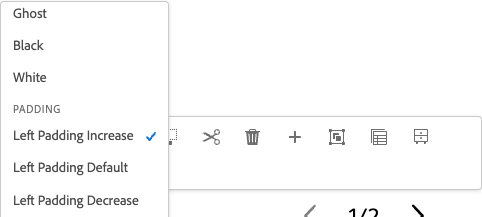
- Padding: Left padding: Increase, default, and decrease
- (Used to create space on the left side of the carousel so the title isn't directly against the left side of the screen, while still allowing carousel items to 'run off' the right side of the screen)
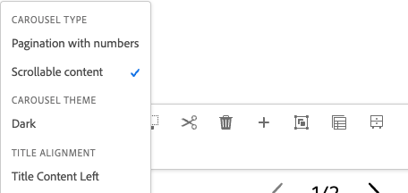
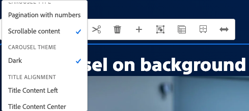
- Carousel type: Pagination with numbers (hero only), Scrollable content
- (Pagination with numbers is used for the hero carousel, scrollable content is used for the main copy)
- Carousel theme: Dark
- (Changes title and controls so it can meet color contrast requirements on different background colors)
All other styles don't apply to carousel component for BSC.com.
Nested components
Brand treatments for nested components:
- Teaser card: Background color, bottom accent gradient (vertical card with no image), accent pretitle, shadow
- Embed: Background color, shadow (currently only accent and white are available)
Functional treatments for nested components:
- Teaser card: Image aspect ratio (adjusts images in teaser cards to be the same aspect ratio), button/link style
- Embed: Vimeo workaround (needed for Vimeo videos to display responsively)
- Image: Image aspect ratio (adjust images to be the same aspect ratio or to be closer aspect ratios to other content types such as cards)
Parent components
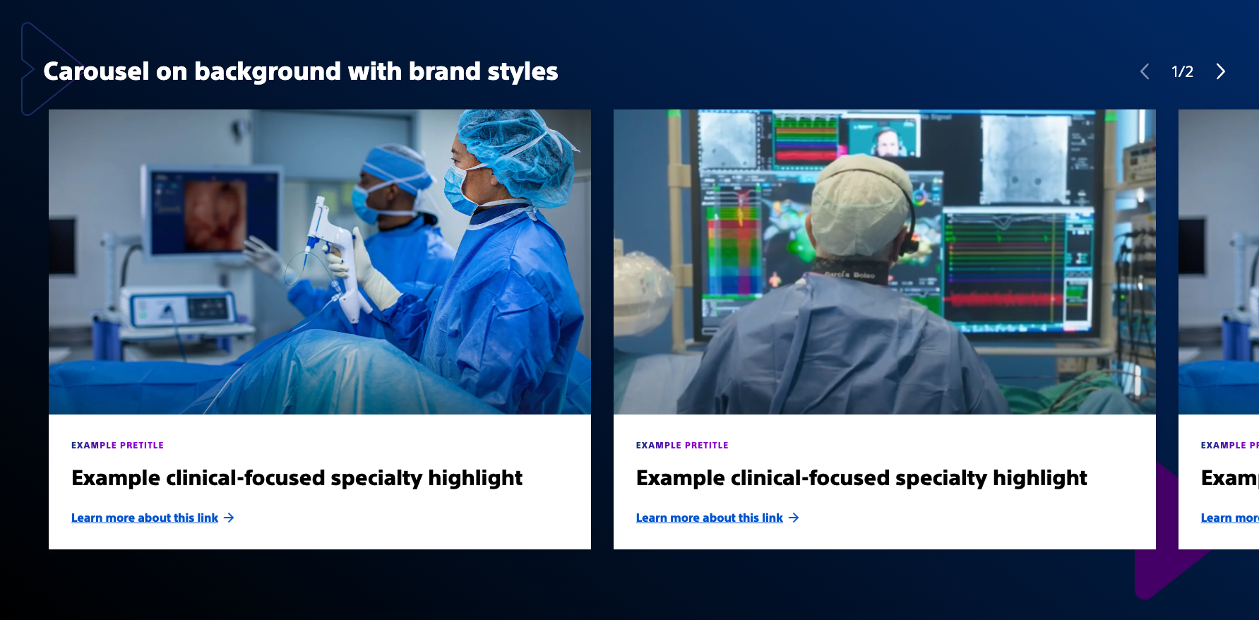
Brand treatments for parent components:
- Container: Background color, arrow pattern
Functional treatments for nested components:
- Container: Top margin (used to create space between other sections)
Examples
Carousel with Card (teaser) Component
How to achieve this look?
Apply the shadow, image aspect ratio, and action link with icon styles to each card.
Carousel with Embed component
How to achieve this look?
Apply Vimeo workaround and shadow styles to each embed component.
Carousel nested in a container
How to achieve this look?
Nest a container inside of another container with a carousel container nested inside that container.
On the outside container add background color and arrow pattern styles.
On the nested container add top margin.
*Tip: To get equal spacing on the bottom, add an empty container below the carousel and apply padding (decrease or default).
Authoring
Authoring offers practical, component-specific guidance for creating, managing, and publishing content in AEM.
How to author carousel with scrollable content
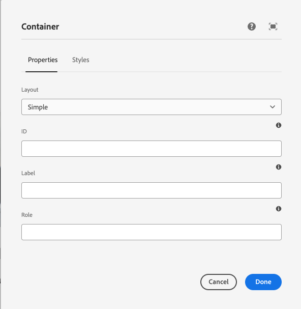
1. Add carousel to a parent container and set parent container to "Simple"
Setting the parent container to "Simple" enables the carousel items to "run off" the screen.
Container (parent) > Carousel
When adding a background color to the parent container, you need to add an additional container to add spacing options.
Container (parent) > Container (child) > Carousel
The "child" container will have top margin to create space on top. To create space on the bottom an additional empty container can be added below the carousel and padding can be added to achieve desired spacing on the bottom.
2. Select carousel type "Scrollable content"
Scrollable content is the only option that works for in-page content. Pagination with numbers is only used for the hero carousel.
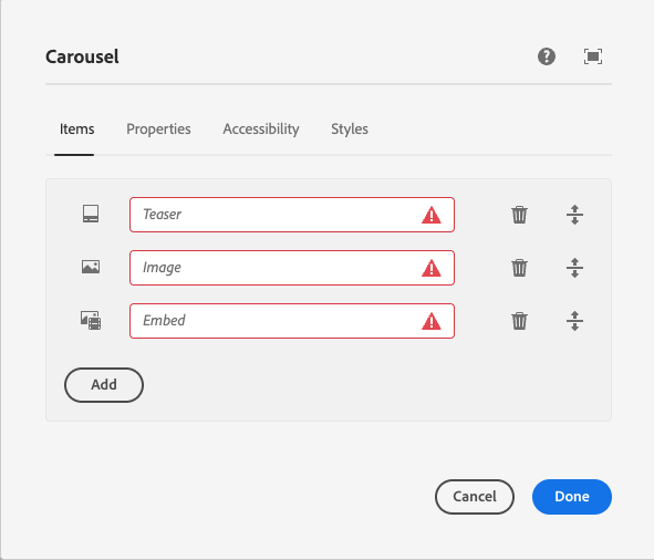
3. Add components to the carousel
In the component dialog, you can add "items." Each item will be a component. Available components include teaser card, embed (video), and image.
Styles can be applied to individual components within the carousel component. See styles tab for more details.
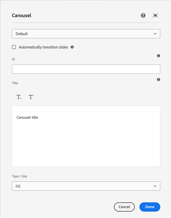
4. Add title to carousel component
In the component dialog, you can add a title. The title should be an H2. Keep the title concise to avoid any overlap with the controls. Titles of child items, such as teaser cards, should be an H3.
5. Add "Left padding" to the carousel
Adding left padding ensures the carousel has space on the left side. There are 3 options available, but "Left padding increase" is recommended for most cases.
Optional step: Choose carousel theme
When adding the carousel to a different color background (e.g. Assertive gradient), you need to change the carousel theme to "Dark" to ensure the title and controls meet color contrast requirements for accessibility.
AEM guidelines
The Carousel Component in AEM supports responsive design and can be configured for manual navigation and horizontal scrolling.
For general information about the Carousel Core Component, refer to AEM’s Carousel Core Component documentation.
Accessibility
This component passes AA WCAG standards. However, changes made by the content owner or implementer could impact accessibility compliance. Be sure to follow code standards and content guidelines to ensure that this component is fully accessible.


