Editable templates
Editable templates increase flexibility, modularity, and reusability. We have two editable templates: full-width and left nav.
- HomePage
- Full-width
- Interstitial
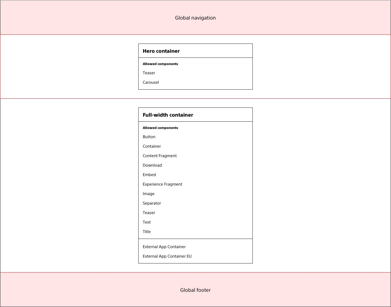
The homepage template has two containers:
- Hero container
- Full-width content container

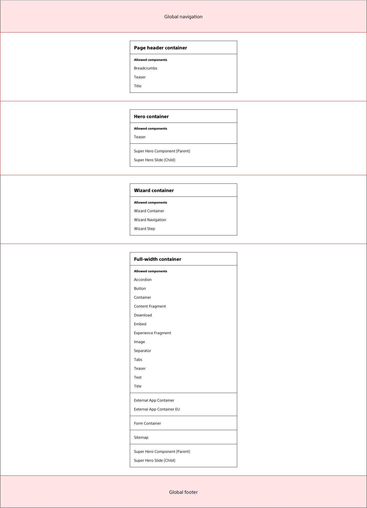
The full-width (content page) template has three containers:
- Page header container
- Hero container
- Full-width content container

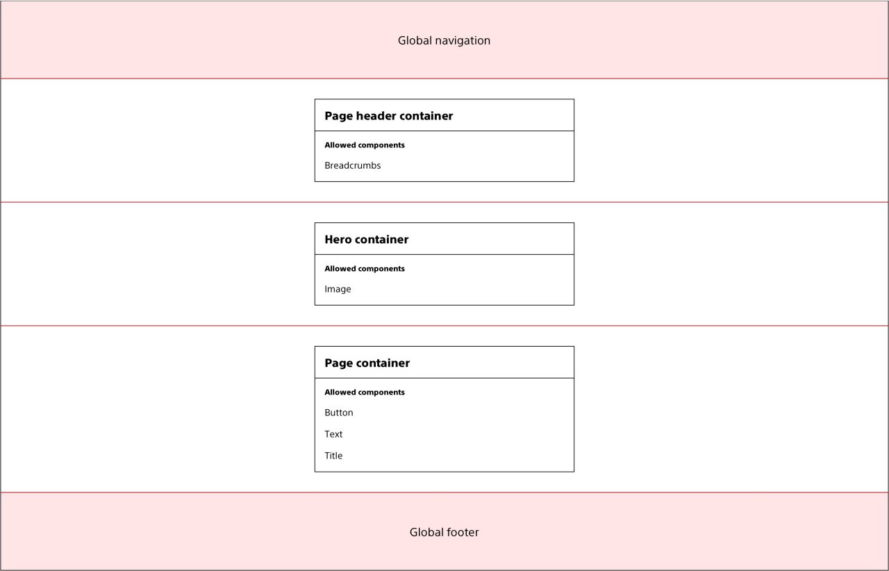
The interstitial template has three containers:
- Page header container
- Hero container
- Page container

Responsive authoring
The AEM responsive authoring feature enables content authors to control the responsive behavior of components across breakpoints, while eliminating the dependency on development workflows and parsys and column control components.
For more information, refer to the Grid page and AEM's documentation and tutorial.
Although AEM responsive authoring allows for hiding elements on certain breakpoints, never hide content across breakpoints. Hiding content is not aligned with best practices for responsive websites because it negatively impacts the focus, tab, and content order and performance of the page.
Configuration
In order to use the responsive authoring feature, the page's Cloud Configuration must be set to /conf/ewp.
For new pages:
- In the Create menu, select Page
- In the Template step of the Create Page wizard, select the desired EWP template
- In the Properties step of the Create Page wizard, click the Advanced tab
- In the Configuration section, set Cloud Configuration to /conf/ewp
For existing pages:
- In the Page Information menu, select Open Properties
- In Properties, click the Advanced tab
- In the Configuration section, set Cloud Configuration to /conf/ewp
Usage guidelines
Using the Container component's responsive grid layout option with AEM's Layout Mode, authors can adjust the width and position of components.
In order to use the responsive authoring feature, the Container component's Layout option must be set to responsive grid.
For more information about the Container component, refer to the Container page or AEM's Container Component documentation.
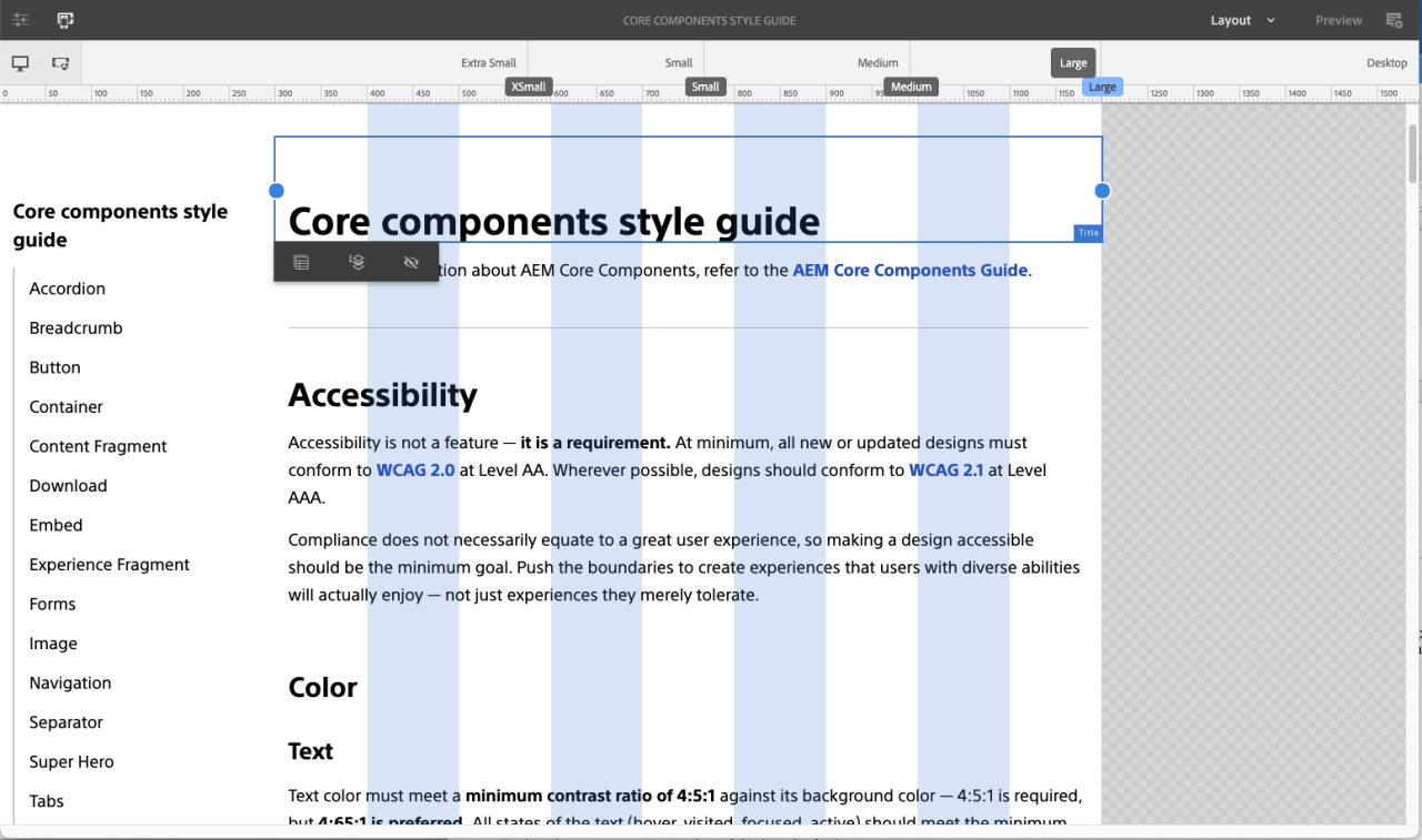
 Example of the responsive authoring view and the AEM responsive authoring grid split between secondary navigation component and page content.
Breakpoints
| Breakpoint name | Min-width | Max-width | Number of columns |
|---|---|---|---|
| Extra small | -- | 576px | 12 |
| Small | 577px | 767px | 12 |
| Medium | 768px | 991px | 12 |
| Large | 992px | 1199px | 12 |
| Desktop | 1200px | -- | 12 |
Column offsets
Column widths and offsets apply to the following content containers on all templates.
The number of content columns must be evenly divisible by the number of components that are side-by-side. For example, if you have six columns available, you will not be able to have four components authored evenly side-by-side.
Column offsets must always be the same for each side. For example, you can’t have one column offset on the left side and two columns offset on the right.
- Full-width container
- Page container
| Breakpoint | Columns |
| Extra small | 12-column content |
| Small | 10-column content, 1-column offset on each side |
| Medium | 8-column content, 2-column offset on each side |
| Large | 8-column content, 2-column offset on each side |
| Desktop | 8-column content, 2-column offset on each side |
| Breakpoint | Columns |
| Extra small | 12-column content |
| Small | 12-column content |
| Medium | 12-column content |
| Large | 9-column content (left nav template and right nav template) 6-column content (left nav and right nav template) |
| Desktop | 6-column content |
Helpful tools
Some helpful tools to streamline work processes and check accessibility compliance:
- Accessibility Insights for web is a free browser extension that reveals the tab order of a page. It also includes tools to verify WCAG compliance through automated checks and manual tests. It’s available for Chrome and Edge.
- HeadingsMap is a free browser extension that reveals the heading structure of a page for automated accessibility and SEO testing. It’s available for Chrome and Firefox.
- Stark is a free browser extension that validates color contrast and simulates 8 different types of color blindness and as well as blurred vision. It’s available for Chrome.


